
Chloroplast & Hemoglobin Similarities
My Role
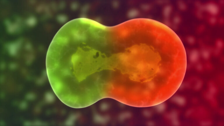
The client wanted to convince potential consumers that green plants’ chloroplasts are similar to human red blood cells, which would then entice them into buying and drinking a new chlorophyll water drink. My job was to show this visually in a short animation. The strategy was to show the similarity using their similar molecular structures. The animation was used on the client’s website as part of the promotion for the new-to-market drink. I was responsible for conceptualization of the approach, as well as all animation and editing.
DISCLAIMER: This science is inaccurate. The molecular diagram clearly shows many differences in both atomic structure and chemical bonding. They are, in fact, different in form and purpose.
I used After Effects for the animation and Photoshop for the preparation of intermediate pieces like storyboards.
The Process
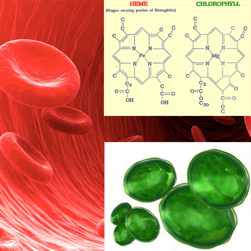
Conceptualizing
I received many assets from the client, but direction was lacking. The first high-level step was examination of all the imagery for organizational purposes. I wanted to establish general aspects like color palettes, timing and early narrative. These images would come to serve as excellent reference material.
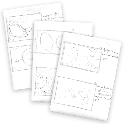
Storyboarding
After some calls and meetings, we agreed on a direction for the animation to follow, and I started with the storyboarding phase. The storyboards started out as rough sketches like these, but they evolved to be more refined as the narrative became more set.
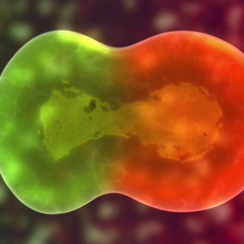
Production
There is an appearance of three dimensions, but it is entirely 2D. In following the storyboard, I made a version that included a merging of the two structures, but seeing it caused a change in direction because it appeared “too realistic.”
Portfolio
- All
- Advertising
- Entertainment
- Pharma DTC
- TV
- Tech
- VFX

Apple – WWDC 2024

The Who Was? Show – Ep. 11

Move Free Ultra Challenge

Durex Easter

Durex 420
Airborne Elderberry

Deadpool

Assassin’s Creed: Unity

Batman V Superman: Dawn of Justice
Cookie Jam
The Who Was? Show – Ep. 9

Wantsuit Animation

K-Y Social Videos
Enfamil Times Square
Donkey Kong Country: Tropical Freeze
Chloroplast & Hemoglobin Similarities
Tony Awards – 2019
Durex “May the Fourth…”
Clients


Contact
Comments? Questions?
Interested in collaboration?
Just wanna say ‘hi?’ Get in touch here:
