Assassin’s Creed: Unity
My Role
This partnersip was a great match because Ubisoft gave minimal direction, and they knew that gave my agency the freedom to debut a first-to-market ad format. The goal for this unit was to increase interest in the release of Assassin’s Creed: Unity, so I treated this similarly to how I would treat an ad for a movie premier. I incorporated one of the game’s trailer videos along with an adaptation of a hero shot of the characters, and I timed the appearance of the elements so the viewer’s eye would be able to follow the motion and see each one in a specific order instead of potentially missing any with a static background. Ubisoft loved it and gave it a tremendous compliment, calling it “inspired genius.”
I used Photoshop to prep the assets and create the mockup, After Effects to do some simple rotoscoping, and Animate with JavaScript to build the final ad.
The Process
Conceptualization
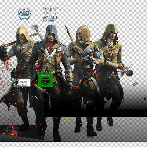
Ubisoft had very loose guidelines in terms of direction, so they sent several existing ad units, to get a feel for their campaigns, as well as a tremendous amount of raw assets - logos, character shots, background elements, etc. Beyond coming up with a layout idea, but I needed to be sure the assets would work technically.
Layout and mockup
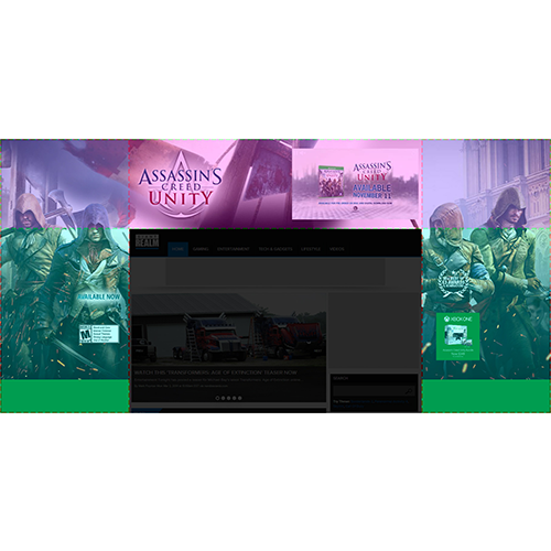
The layout for this unit combined skins on each side of the site's content with a full-width section (with similar dimensions to a pushdown) above the content. This mockup shows the skin areas (in blue) and the top section (in pink). Each section needed to be transparent, so the top corners (in purple) could overlap and work well together.
Production
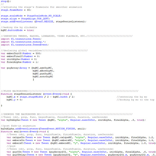
Because the top section was designed to be full width, I needed to figure out a way for it to react to a viewer's browser width on load and adapt to any changes in width. As I added the code for animation, I was able to align everything to the top left and have the section adjust the placement of elements according to any stage width changes.
Portfolio
- All
- Advertising
- Entertainment
- Pharma DTC
- TV
- Tech
- VFX

Apple – WWDC 2024
The Who Was? Show – Ep. 11

Move Free Ultra Challenge

Durex Easter

Durex 420

Airborne Elderberry
Deadpool

Assassin’s Creed: Unity
Batman V Superman: Dawn of Justice

Cookie Jam
The Who Was? Show – Ep. 9

Wantsuit Animation
K-Y Social Videos
Enfamil Times Square
Donkey Kong Country: Tropical Freeze

Chloroplast & Hemoglobin Similarities
Tony Awards – 2019
Durex “May the Fourth…”
Clients


Contact
Comments? Questions?
Interested in collaboration?
Just wanna say ‘hi?’ Get in touch here:
