
Enfamil Times Square Animation
Enfamil Times Square Static
My Role
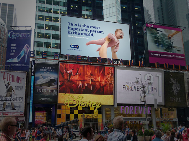
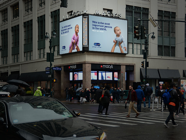
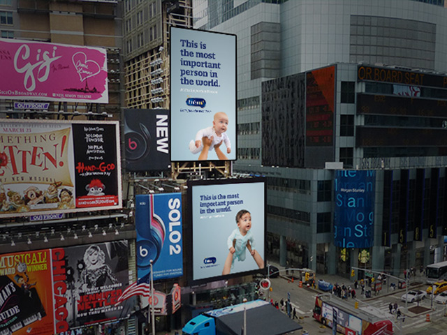
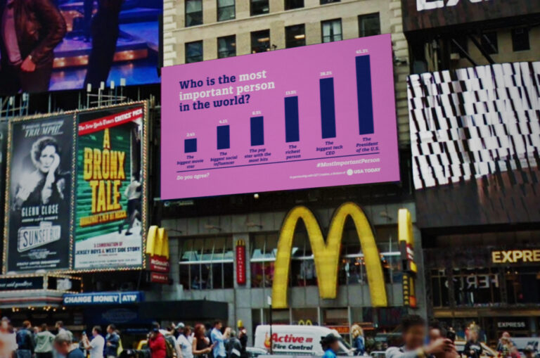
This Enfamil campaign was a release of billboards in New York City’s Times Square. There were 8 static image signs along with one animated version. One of my tasks was to organize, edit, lay out, and package the static sign imagery. I was also to build a looping animation for the last billboard. The animated sign was more fun to work on, but the required lack of Enfamil branding makes me think the static signs connected with consumers better.
I used After Effects for the animated Times Square billboard, Photoshop for the layouts of the static billboard images, and InDesign for the final packaging and delivery to the Enfamil brand for printing.
The Process
Conceptualization
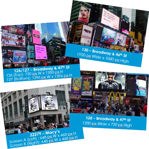
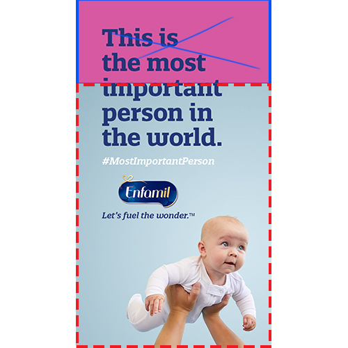
Among the assets received from Enfamil were some examples of each of the billboards that would be used for the various images in the campaign. Each image has pixel dimensions that I would use in laying out all the final imagery.
Sourcing assets
The assets also included numerous studio shots of various babies to use for the billboards. The messaging was consistent for all the signs, but several of the images needed to be altered and extended to fit the final resolutions as specified.
Production
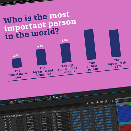
The animated billboard allowed me to work with text animators and some overshoot in revealing the content. While not very complex, those simple additions gave the sign a bit more life and interest, allowing it to compete better for New Yorkers’ attention.
Portfolio
- All
- Advertising
- Entertainment
- Pharma DTC
- TV
- Tech
- VFX

Apple – WWDC 2024

The Who Was? Show – Ep. 11

Move Free Ultra Challenge

Durex Easter

Durex 420

Airborne Elderberry

Deadpool

Assassin’s Creed: Unity

Batman V Superman: Dawn of Justice

Cookie Jam

The Who Was? Show – Ep. 9

Wantsuit Animation

K-Y Social Videos
Enfamil Times Square

Donkey Kong Country: Tropical Freeze

Chloroplast & Hemoglobin Similarities
Tony Awards – 2019

Durex “May the Fourth…”
Clients


Contact
Comments? Questions?
Interested in collaboration?
Just wanna say ‘hi?’ Get in touch here:
